3D Website Crash Course — Part 1: Research (Deep Dive Edition)
Welcome to Episode One of this 3D Website Crash Course — where we take a real product, a real brand, and build a fully interactive 3D experience from scratch.
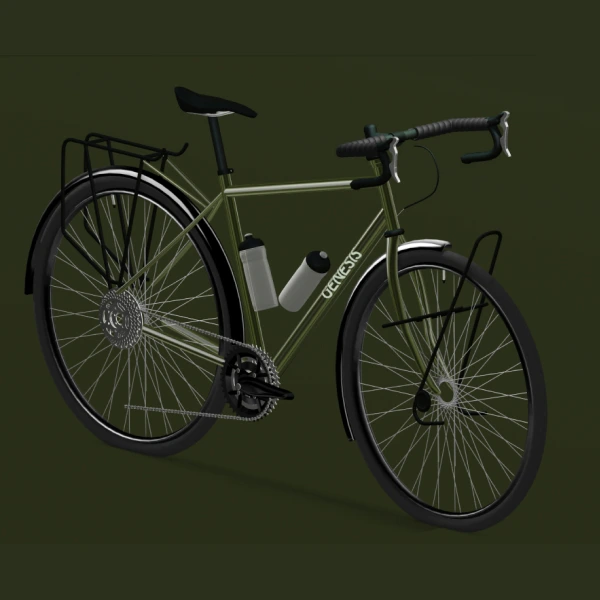
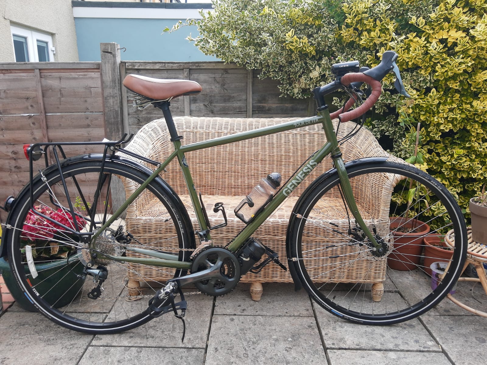
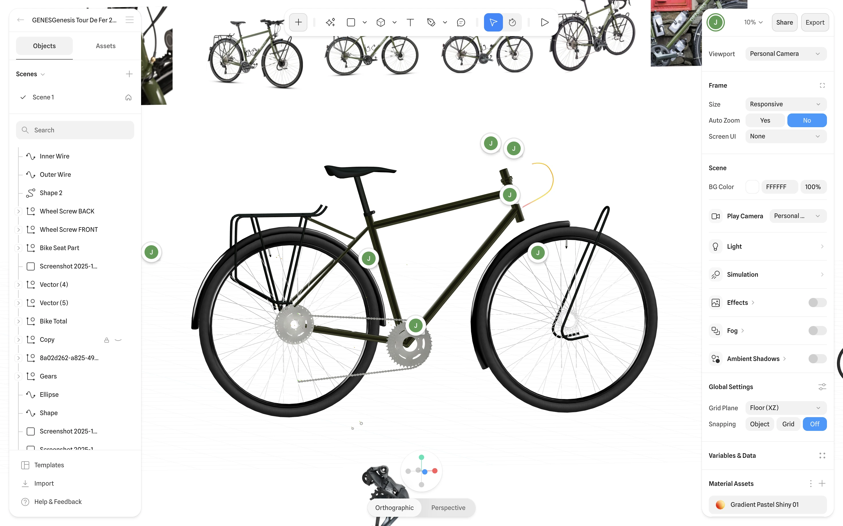
The subject of the build? Genesis — specifically inspired by the Tour de Fer 20, a bike I own, ride, and absolutely love.
Instead of quietly working on the project in the background, I’m documenting everything — from the early scribbles all the way to production-ready 3D interactions.
And like every project I take seriously, it all starts with one thing:
Research.
Why Research Comes First
Before opening Blender, firing up WebGL, or designing a pixel in Figma, I start by grounding myself in why the site should look and feel a certain way.
Research helps me define:
- The emotional tone (adventure, ruggedness, reliability)
- A visual language that matches the brand
- Where 3D can enhance — not overwhelm — the product
- What competitors are doing (and failing to do)
- What the final experience should NOT become
Good research isn’t about stealing inspiration — it’s about removing guesswork.
Understanding Genesis
Genesis isn’t a hyper-performance race brand yelling carbon-aero-everything.
They sit in that adventure-first space — touring, gravel, exploration, the “go further even when you’re not sure where you’re heading” vibe.
Their current website works… but:
- It’s product-first rather than experience-first
- It isn’t visually cinematic
- It leaves storytelling potential on the table
That gap is where the 3D concept lives — creating a digital experience that reflects the feeling of owning the bike, not just listing features.
The mantra I keep coming back to:
Elevate the brand’s identity, don’t rewrite it.
Competitor + Category Study
Next, I study what’s happening across cycling and adjacent categories.
I look at:
- Direct bike competitors
- Adventure + outdoor brands
- Premium UI experiences
- WebGL-heavy sites
- Any company already pushing interaction design
Patterns I notice:
- Some brands lean ultra-premium
- Some go sporty, racing-focused
- Some are rich in visuals but shallow in storytelling
- Others communicate well but don’t feel exciting
Mapping this spectrum helps me position my build:
Adventure-forward, clean, tangible, informative — with 3D serving clarity, not distraction.
Studio-Level Inspiration Sources
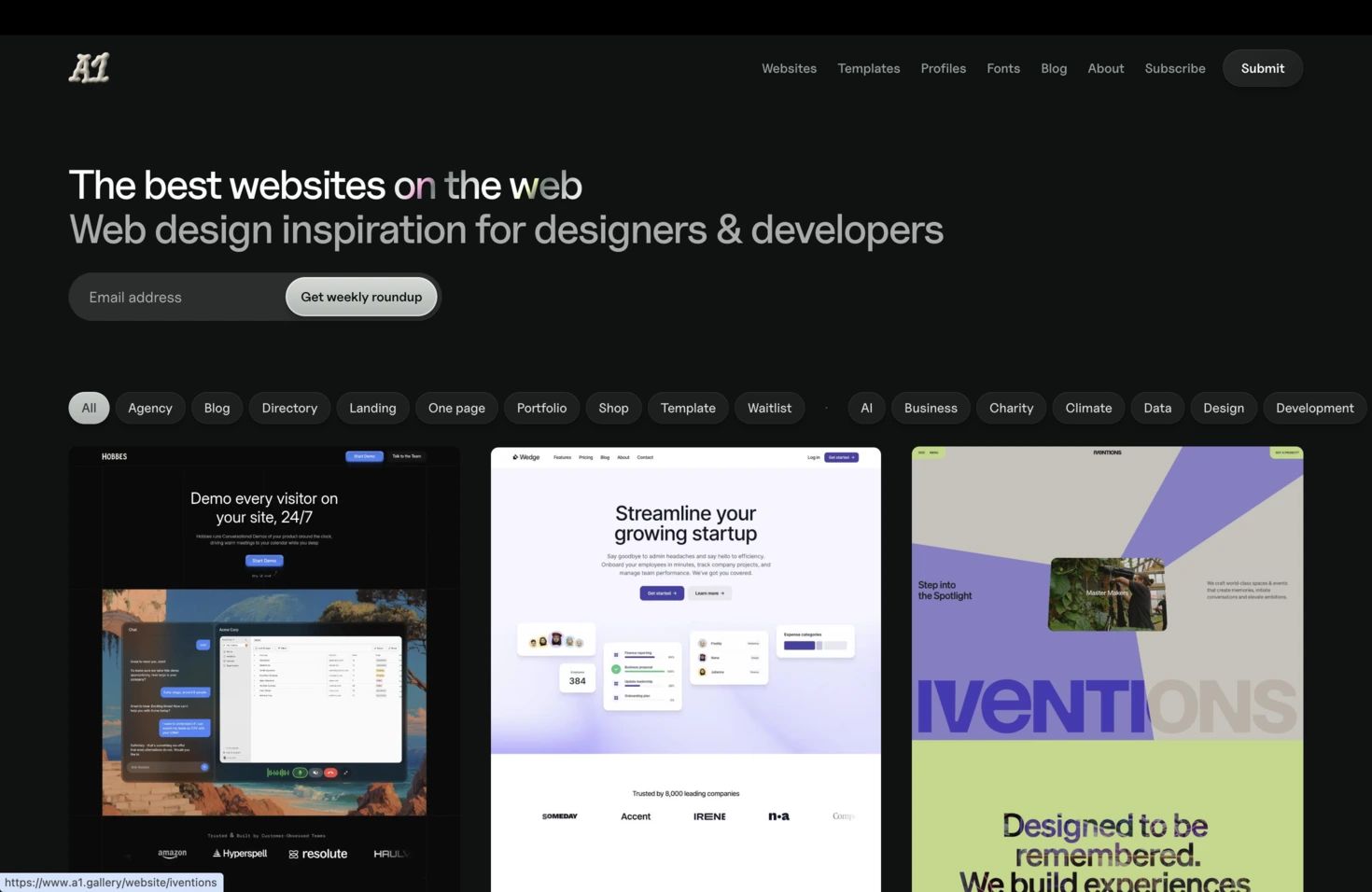
From here, I pull influences from design spaces outside cycling — studios known for strong identity work.
Some references from my clipboard:
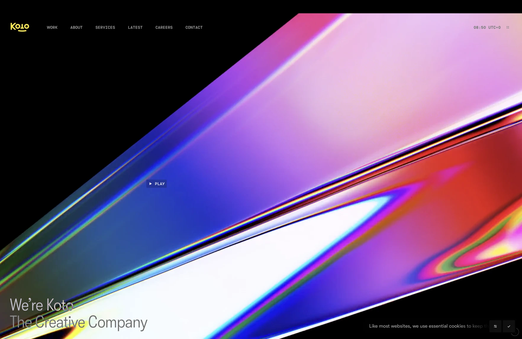
- Koto — beautifully simple, strategic identity work
- Ragged Edge — bold brand storytelling and confident layouts
- A01 / A1 (depending on how you heard it) — minimal, elegant execution
- Mobin / Jack styling references — tactile, interesting motion + type
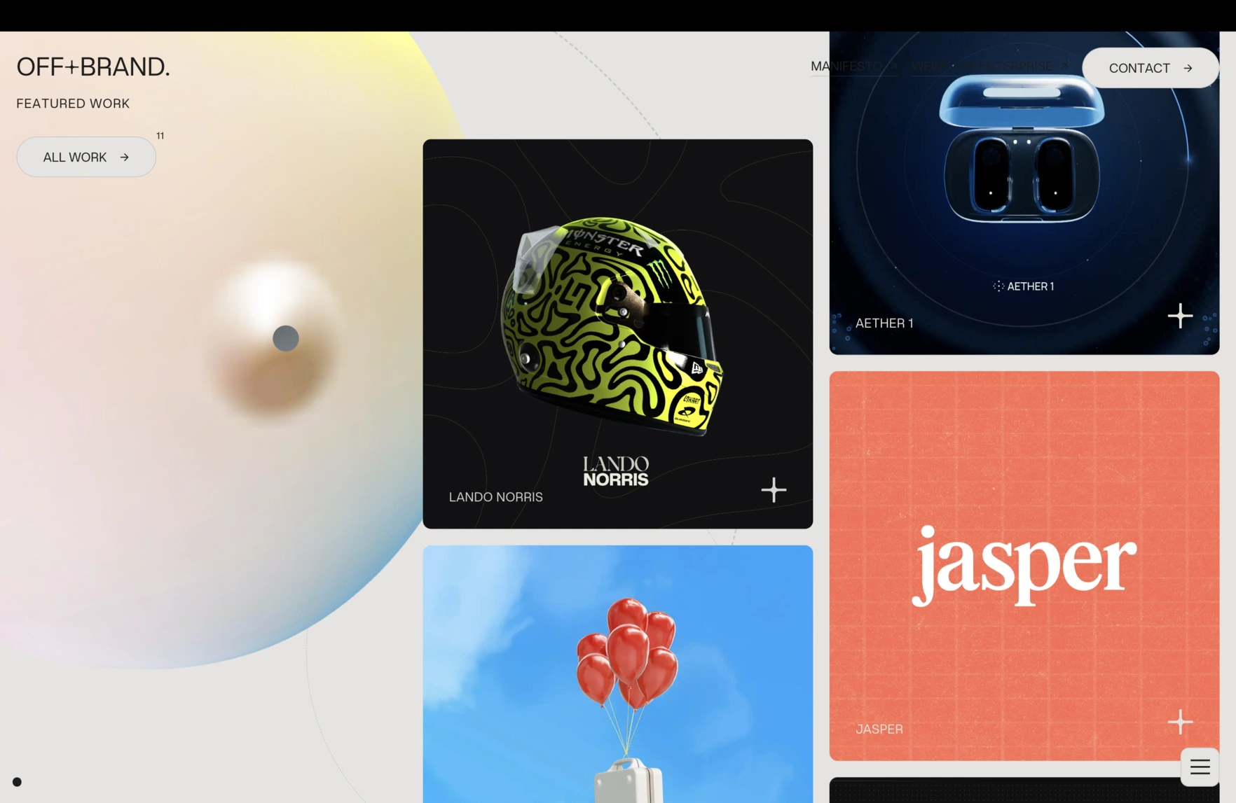
- Offbrand agency - killer Glasgow based agency
I’m not copying them — I’m extracting lessons:
- How bold is too bold?
- Where can typography carry tone?
- How do brands use whitespace vs. photography?
- What UI gestures feel adventurous vs. clinical?
Again — ingredients, not templates.
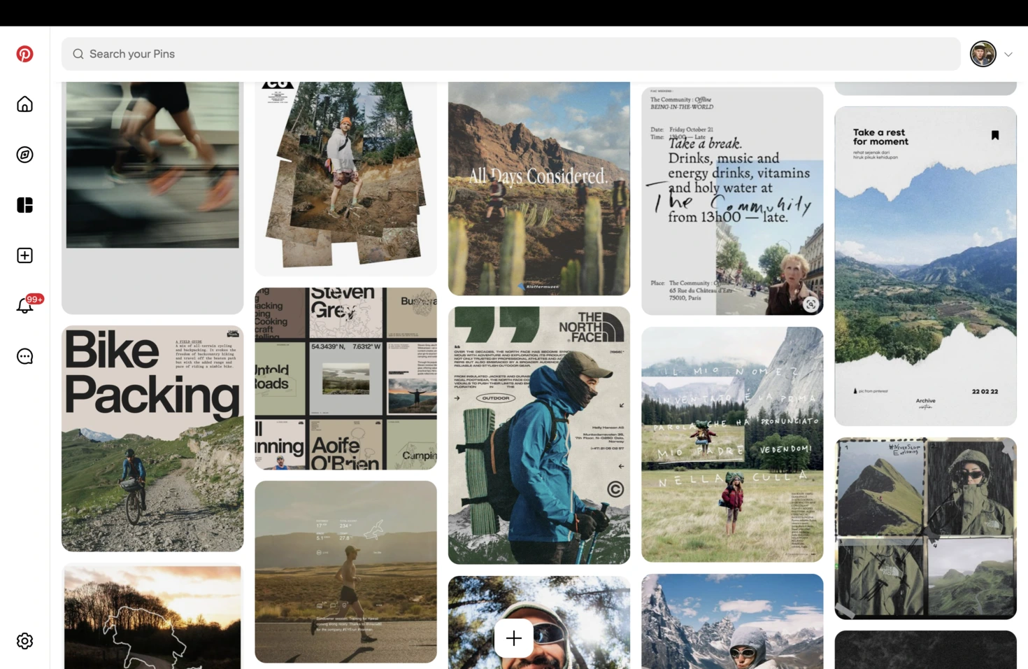
Building the Visual Universe
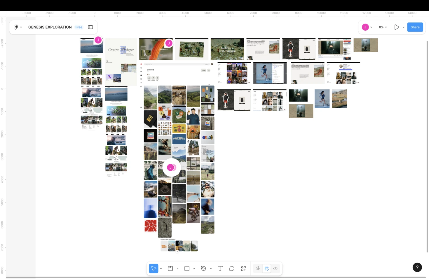
Once I’ve soaked in brand, competitors, and studio influences, it’s moodboard time.
Tools: Figma, every time.
My reference boards include:
- Color palettes — earthy/outdoorsy tones vs. high-contrast UI
- Typography — rugged serif, clean sans, mixed approach?
- Photography direction — gritty gravel vs. studio polish
- UI interactions — scrolling depth, pinned elements, motion
- 3D renders that evoke adventure, not just pretty shading
- Navigation patterns — including that off-canvas menu treatment
Seeing all these pieces together helps me define:
- What visuals stay true to Genesis
- What pushes the site forward
- Where to pull back instead of flex
By the end of moodboarding, I’ve got a north star:
A grounded, human, curiosity-driven experience that visually matches the act of touring itself.
Where Research Leaves Us
After gathering all this:
- I know the emotional tone
- I know the visual identity boundaries
- I know the UX style that fits the brand
- I understand the competitive landscape
- And I have a toolbox of design references from cycling AND world-class brand studios
This gives me the confidence to move into design without guessing.
What’s Next
Part 2 is where I start the 3D.
Next episode:
Defining structure, flow, and the essential story the site needs to tell — before a single pixel gets fancy.
See you in Part 2.
Ciao.
%20(1).jpg)