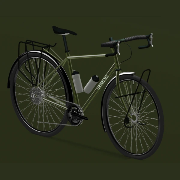
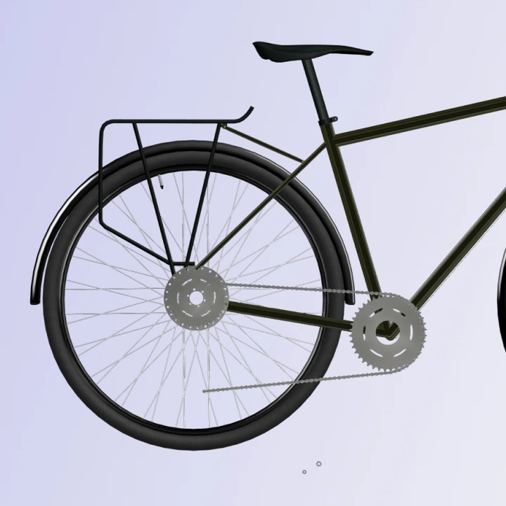
These websites are the most interesting immersive websites that use Spline. What I love about these is that Spline completely changes how excited you are to scroll and engage with the websites. It also makes the products so much more vivid. Wait, before we look at these mad examples of creativity, what is Spline though?
What is Spline?
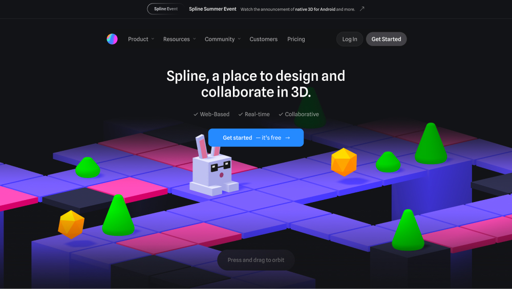
Spline is a web-based 3D design tool that stands out for its simplicity and ease of use, especially for users who may not have extensive experience with 3D modeling. Unlike traditional 3D software like Blender or Cinema 4D, which often have steep learning curves, Spline is designed to make 3D creation accessible to designers of all levels.
Key differences from other 3D modeling tools include:
- Real-Time Collaboration: Spline allows multiple users to work on the same project in real time, making it highly collaborative, which is not common in most other 3D tools
- No Coding Required: Spline lets you create interactive 3D experiences without needing to write code. This is especially useful for web designers, as you can easily export your designs as embeddable components (e.g., React code)
- Browser-Based: Unlike most 3D tools that require software installation, Spline runs in the browser, making it more accessible and easier to integrate with other web projects
- Interactive 3D Content: It focuses on interactivity, letting users create animations and interactions directly within their models, which can then be embedded on websites without needing advanced programming knowledge
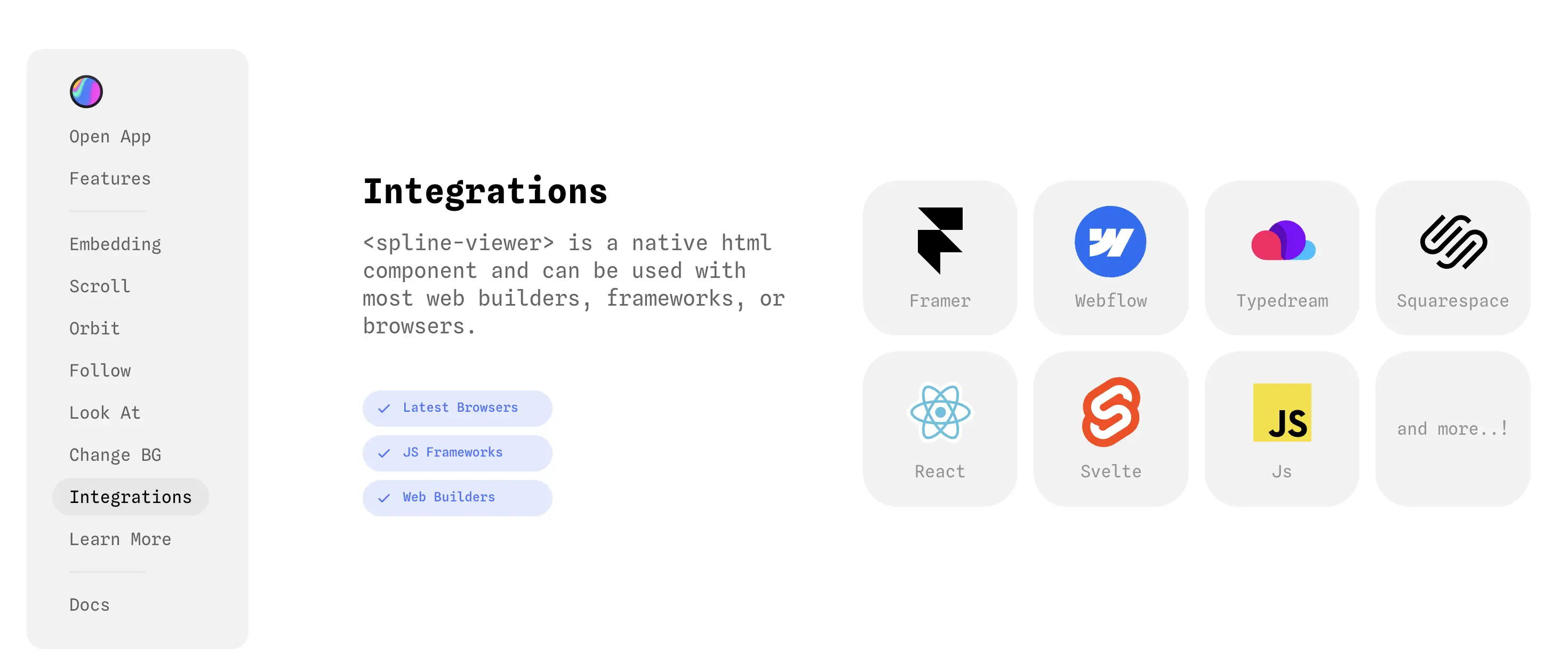
Overall, Spline simplifies 3D design and interaction, making it highly suited for web and UI designers who need to incorporate 3D elements into their work but don't want to dive deep into complex modelling software.
Want to learn more? Recommend checking out Spline docs.
15 Best Spline Websites
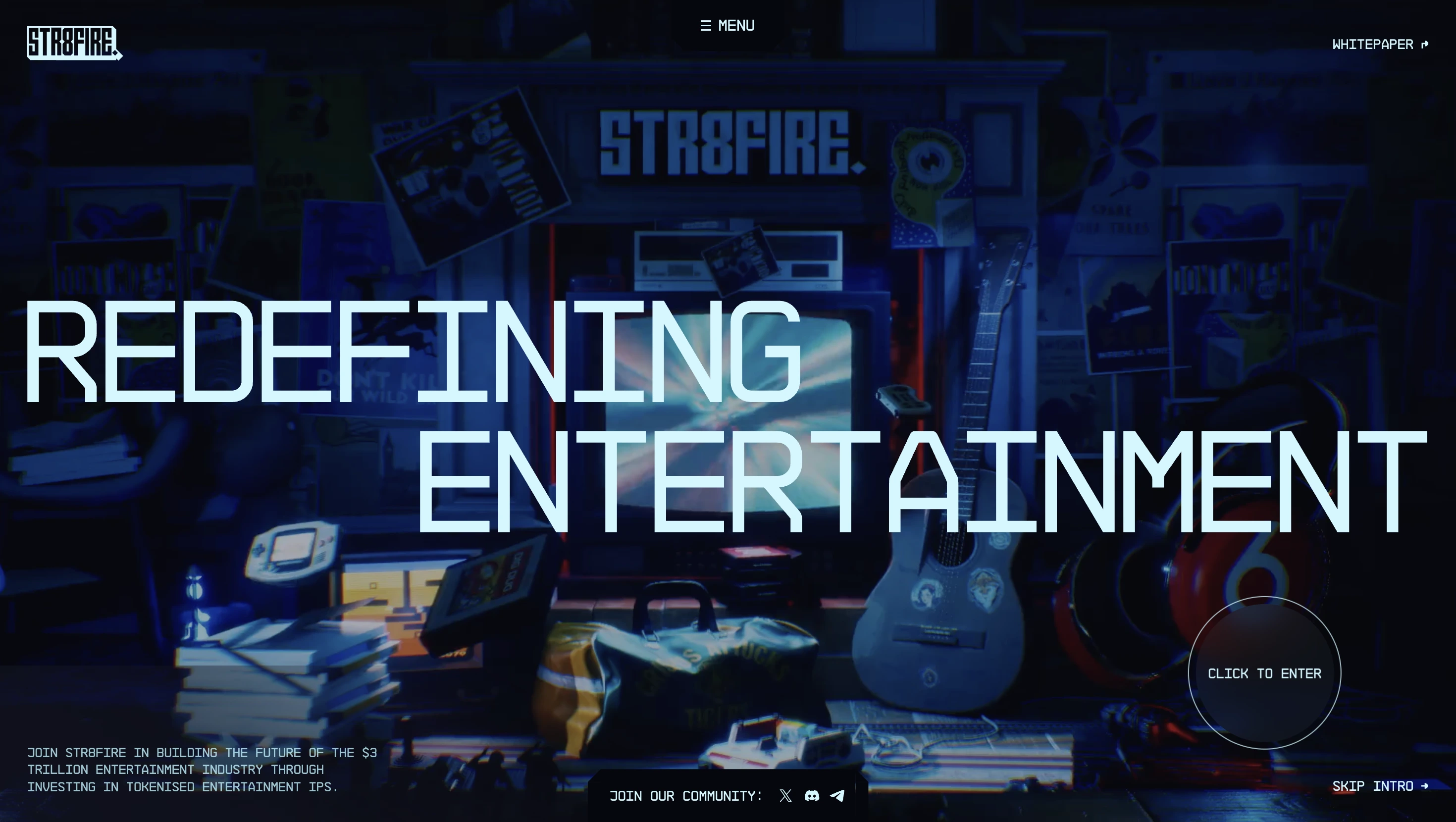
1) STR8FIRE
"STR8FIRE redefines the entertainment industry. Original and renowned Web2 IPs are transformed in play-to-earn games and NFT collections that unlock ownership and rewards for the Web3 community."
Dylan Brouer killed this one.
Sexy loading animations, mad 3D graphics and great storydriven scroll animations and copy. Fire.
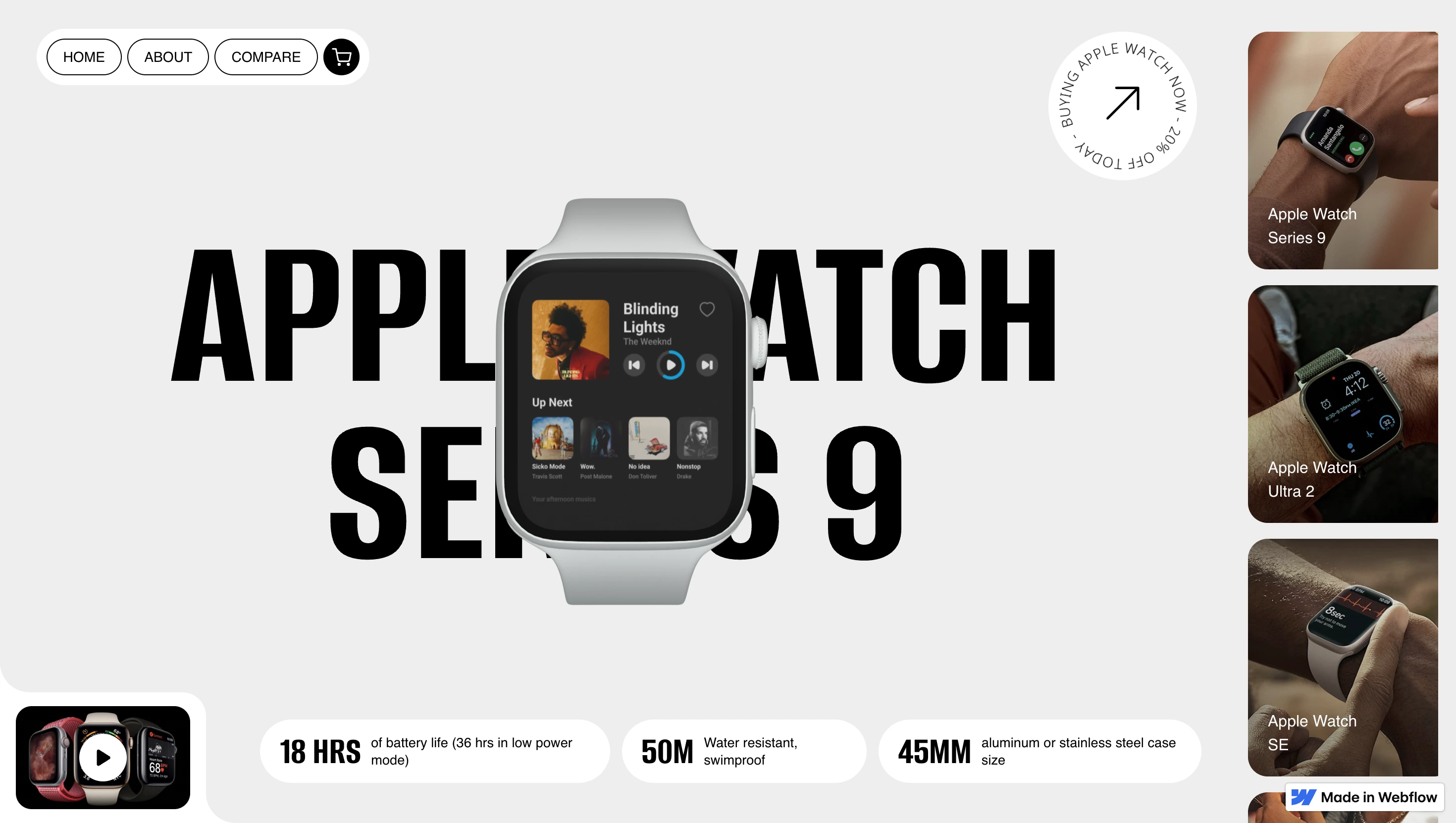
2) Apple Watch Collection
"A landing page introducing Apple Watch, playing around with Spline 3D."
Zoe Tang - take a bow.
Love the simple yet powerful scroll effect. Cool layout of this website too with nice layout.
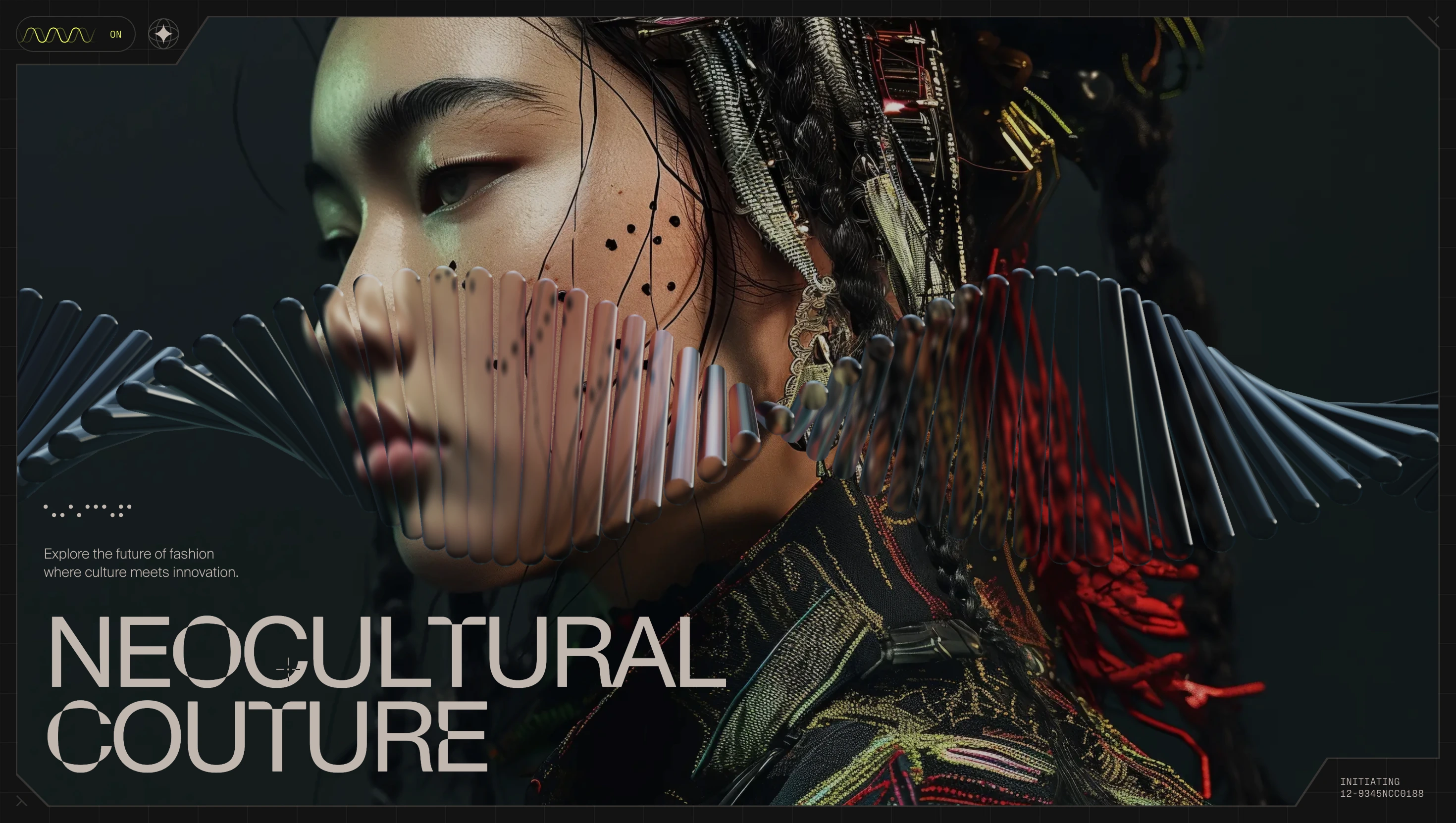
3) Neocultural Couture
"NeoCultural Couture explores futuristic fashion themes inspired by the rich narratives of global cultures and powered by the latest in AI innovation. The collections offer a unique exploration of time, tradition, and tomorrow."
Jordan Gilroy is a killer designer but really shows off his developer skills with this project.
This project has this mad glass effect in the hero and a really interesting element fixed to the centre of the screen.
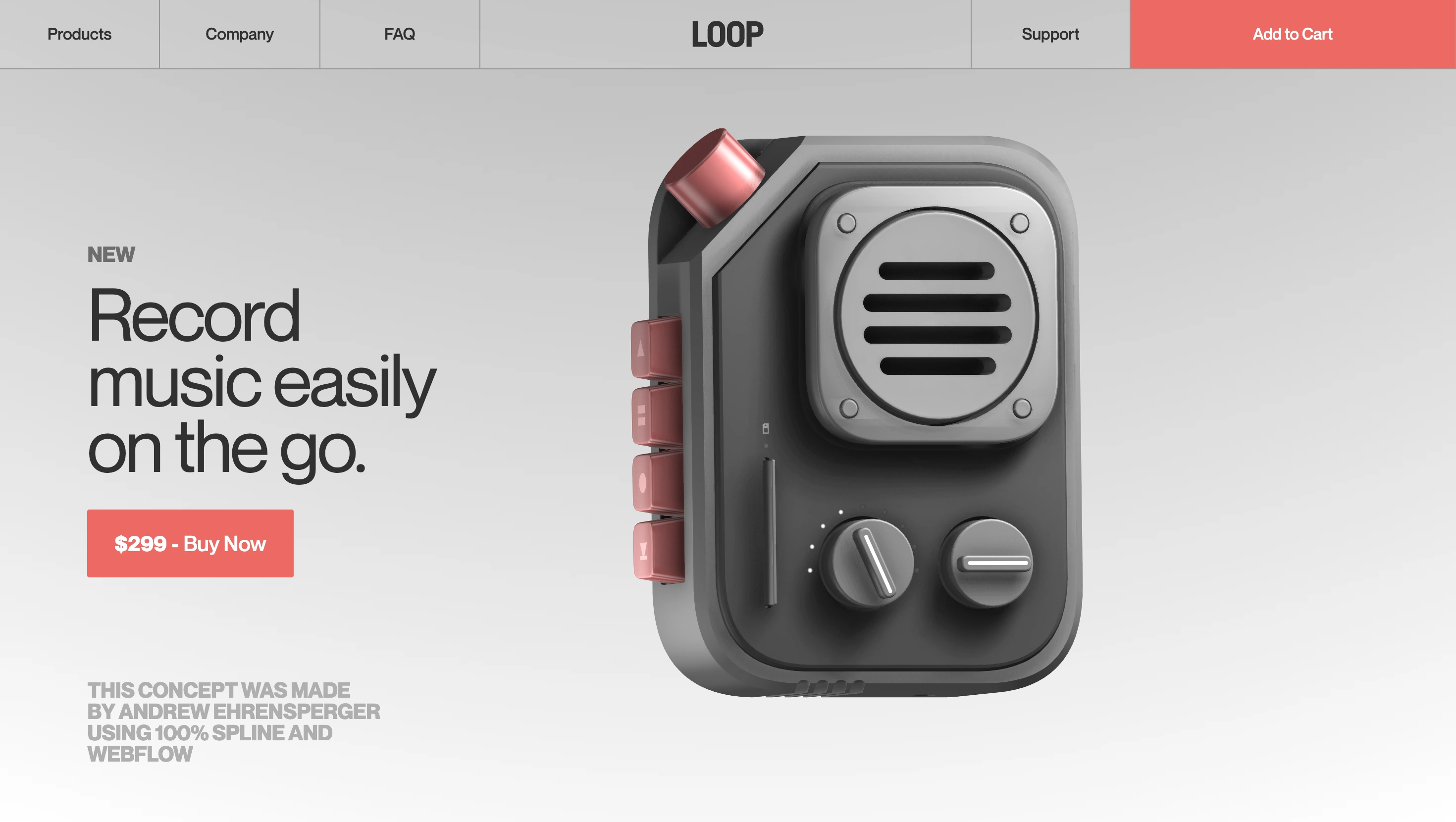
4) Loop
"LOOP Music Recorder, made in Spline and integrated with page scroll interactions. Optimized for different devices.You can find the file in the Spline Community."
Andrew Ehrensperger is no slouch - in fact, a lot of the websites in this list are his. Such a powerful, simple website with one killer asset that just slams.
5) Iridescemt AI
"This is landing page for a fictional AI weareable, created to explore how we can use Spline to generate dynamic, interactive abstract scenes to compose a futuristic layout."
Diego Toda de Oliveira is a Spline and Webflow machine. This man has done so much for the Spline community - check out his YouTube channel here.
This website is the wildest scrolling experience - super interesting example of Diego's work.

By the way, here is a great tutorial on his YouTube channel:
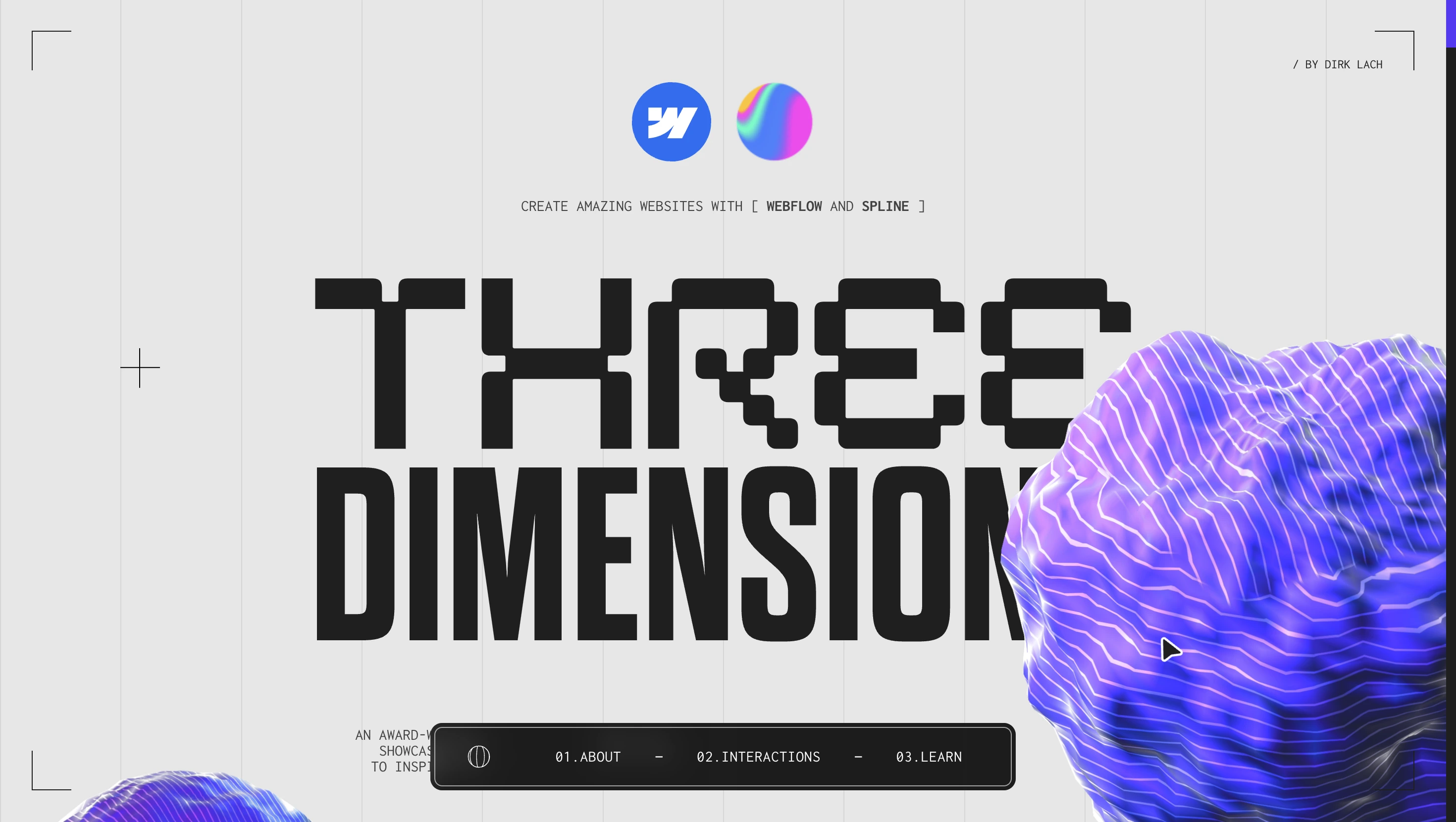
6)Three Dimension
"An award-winning showcase site with the sole purpose of showing Webflow & Spline in combination and providing some examples of how 3D experiences can be integrated into websites."
Dirk Lach shows off Spline and Webflow together to it's fullest extent.
He's only got 3 videos on his YT channel but all very useful if you're a little bit more advanced.
7) Avora AI
"I brought the jet in from Blender, where I ensured it would be optimised for Spline before bringing it into Webflow. Inside of Spline, I created the environment, including the radar pulse and scan, as well as the scene materials. From there, I embedded the Spline scene into Webflow and used Webflow's Interactions panel in order to create an engaging page scroll experience."
Another banger from Andrew Ehrensperger.
He uses the central plane asset as the focal point but then has the asset within the centre. The black and white colour palette along with the modern plane is incredible.

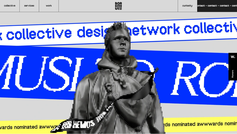
8) Rob Hemus
"It's amazing what you can do with Spline on Webflow. To create the 3D model, we got reference photos of Rob's head of each quarter angle. In Blender, we used the KeenTools FaceBuilder to recreate Rob's head and face. We optimized the model before bringing it into Spline by decimating the mesh, so that we had an appropriate poly count. In Spline, we applied materials and created the the ribbon which spins and twists around 3D Rob!"
This website was a huge inspo for me to start Spline. The loading animation, the wild interactions, on scroll, the gallery and of course, the pixelated asset.
9) Sentinel
"When the high-poly model of the DNA strand was tested, Spline reported that the scene was optimized. Although it is optimized for the web, on mobile I noticed that the scene was very choppy whilst scrolling. I created a second Spline scene with a low poly DNA model which seemed to solve the problem.Well... not quite! Then came the issue of figuring out how to switch out the scenes at the beginning of the tablet breakpoint. I had both of my Spline scenes in Webflow in two seperate Spline Viewer elements, and would hide or show them on selected breakpoints.I noticed that when resizing my window on the published site, that the transition from one Spline scene to the next would only work with a page refresh. I used some JavaScript to reload the page automatically if the user were to manually resize their window below 992px in width."
Fascinating write up from Andrew Ehrensperger there. Key to note is that optimising your scene is key for web and requires some troubleshooting to ensure a smooth scroll experience.

10) Happy Lemon
"The actual creation and integration of the Spline scene into Webflow involved ZERO code! I only used custom code for the loader and the site's smooth scroll."
Yet another example of Andrew Ehrensperger's genius!
Simple but highly effective website! Love the leaves encircling the lemon which scroll up as the user scrolls down the page.

11) Flowcard
"Flowcard is a fictional and simple landing page focused on showcase the power of the Webflow + Spline integration. All the 3D animations were done using Webflow interactions."
Diego Toda De Oliveira with a beautifully simple example of a scroll animation. Love how it slots in to the different sections to explain the features clearly.

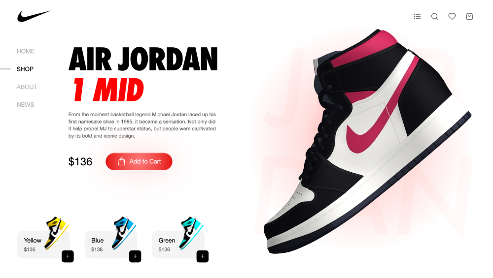
12) Nike Air Montreal
"I'm excited to unveil my latest project with Rollin: a stunning Nike shoe landing page! 👟✨ We combined the power of Spline and Webflow to create an immersive 360-degree product experience."
Another killer website from Zoe Tang - mad to see brands like Nike embracing Spline.
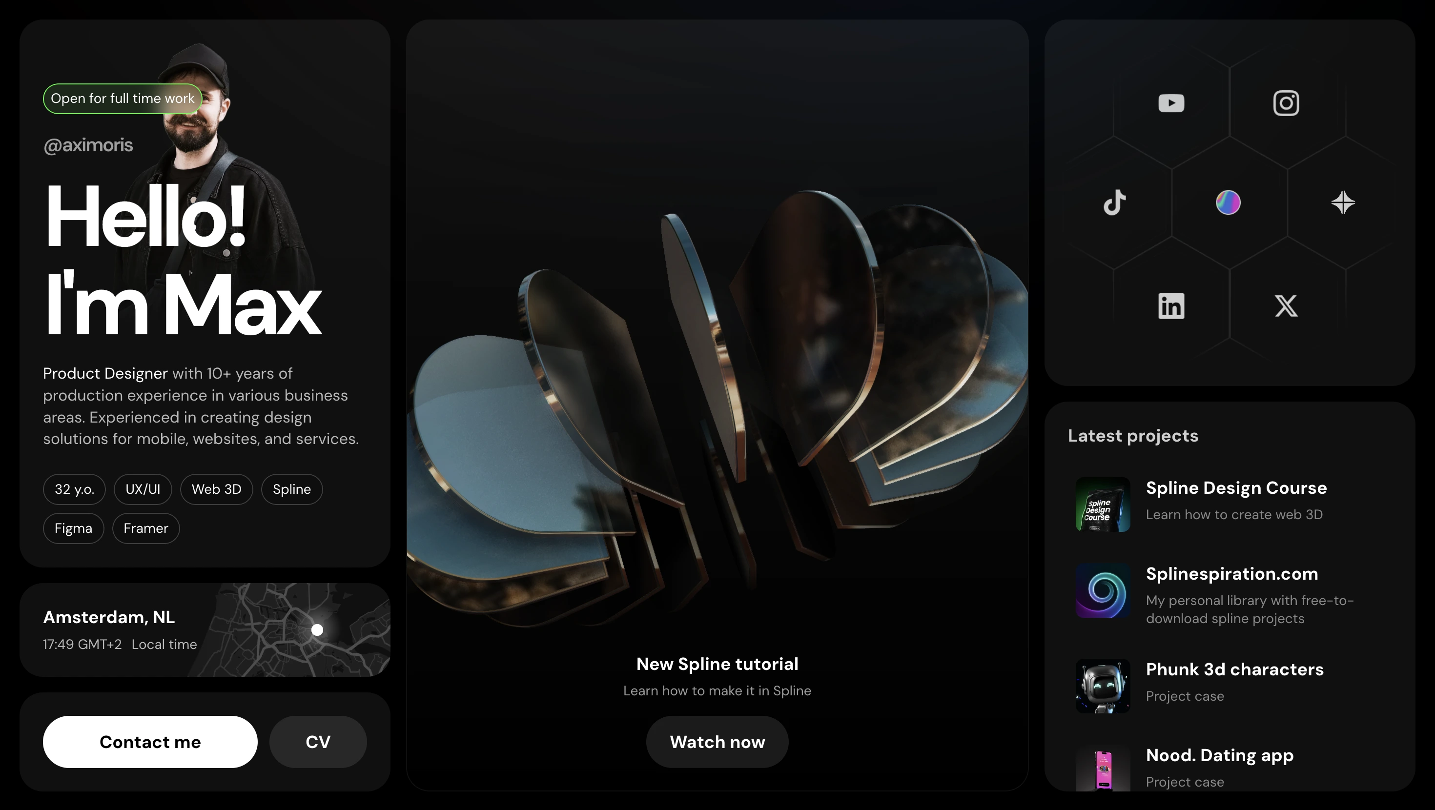
13) Axi Morris
"Finally, I finished my personal web page, which now has all the necessary links and information in one place! It's just the first version; many things will be added later."
Maksim Borisov is the man.
He does so much for the Spline community too so recommend following him on all socials but particularly his Spline account.
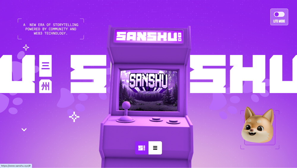
14) SANSHU
"I had the pleasure of working on an exciting project for SANSHU, where I developed their website using Webflow. The goal was to create a visually engaging and interactive experience, so I integrated a Spline scene that reacts dynamically to scrolling."
This article I realise is like a Andrew Ehrensperger's portfolio practically but alas, here we are.
15) Phunk
"I was fortuned to create a visual set of characters for the new Phunk website.The task included designing 3D characters as web interactive models for the next web integration and set of static images. So every model had 2 versions: optimized for web usage and HQ for static images."
Phunky little characters (see what I did there) with playful expressions and movements. It gives so much life to this website.
Another great website from Maksim Borisov.

Conclusion
What I hope you see from this article is that Spline is not just for creating static assets but ones that are highly interactive and engaging. Not only can these 3D assets help capture users attention to highlight particular product or service features more vividly, but they also encourage users to spend more time on the site. Want to get started with Spline?

